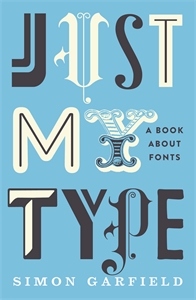
Just My Type
I’ve just finished reading Just My Type, a book about fonts by Simon Garfield. As the name suggests, it deals with a field that was for centuries esoteric, but is now commonplace: typography. Garfield takes us through the history of type, stretching from Gutenberg and Garamond all the way to Calibri and iBooks. Along the way, we get to learn about Letraset and Selectics, Eric Gill’s bizarre sexual proclivities, and the short, sad tale of Doves (don’t bother looking for it in your font menu - it’s not there).
The book is meandering and conversational, wandering from one area of interest to the next without getting bogged down in technical details. This makes it and easy and pleasant read, but occasionally causes frustration. For example, the “hot metal typesetting” is mentioned several times in the early chapters, but not explained until chapter 17, mid-way though. However, in spite of (or perhaps because of) the lack of technical details, the enthusiasm that both the author and his interviewees have for the subject shines through. It’s also a wonderful book to look at, with plentiful illustrations, and samples of the types being discussed throughout.
In short, this book isn’t going to teach you the nitty-gritty of type design, but it does offer a good introduction to the subject, and prompts you to look more closely at the fonts that pervade the environment. Definitely recommended.
