The Beginner's Mind

10 Feb 2025

One of the things I’m enjoying about dipping my toe into CAD is the chance to approach something as a beginner. I rarely get — or perhaps make — the opportunity to do something that’s both unfamiliar, and low enough stakes that I can take risks and take my time. I’m making a conscious effort to not bring my preconceptions from adjacent fields, and not rush towards the first thing that will achieve my practical ends (although I freely admit that I sometimes fall short on both counts). There’s a wide world of new concepts and ideas, and it would be a waste to simply give the ones I already have a fresh coat of paint. Once I know the lay of the land, I imagine I’ll be able to put my old experience to work alongside the new, but for now I’m going to go slowly, keep my eyes open and fresh, and learn.

Three Shots

31 Jan 2025

Most keys on most keyboards are labelled in some way. Usually, these labels (“legends”) are just printed on top of the keycap, the bit of the key you actually touch. But because you’re actually touching it, the legend wears off over time. As you move into fancier keyboards, there are various ways to remedy this. The most indestructible are double-shot keycaps, where the legend is actually a separate piece of plastic that goes through the main keycap like the letters in a stick of Blackpool rock. This can let your tasteful RGB lighting shine through, but more importantly means the legend will never wear out.

Producing intricately-enmeshed plastic shapes is an area where 3D printing in general, and multi-material 3D printing in particular, stand out, so since getting my printer I’ve been itching to try and make some keycaps of my own. It also offered a perfect opportunity to try out my new 0.2mm hotend (the default is 0.4mm).

Rather than trying a full set straight off the bat, I decided to go for something more modest. I occasionally use my first mini-keyboard as a macropad, but recently realised that the otherwise-unused outer rows of my Corne would do just as well. Updating the firmware was straightforward1, so I just needed half a dozen keycaps with custom symbols.

OpenSCAD coupled with colorscad seemed like the tools for the job, and the comprehensive KeyV2 project on GitHub provided a flexible way to create keycaps in a wide variety of profiles. Importantly, this includes the DSA profile that I was already using, so I started with that.

It was easy enough to add an embedded shape in a contrasting colour, but when I printed it I ran into an in-retrospect-obvious issue; the dish at the top of the key produces some very obvious layer artefacts when sliced:

Rendering of a DSA keycap, showing layer lines

These kind of artefacts are unavoidable in FDM printing when making a surface at a shallow angle to the plane of the layers. You can sometimes minimise the impact by positioning your model at an angle, but that often introduces other problems — for example, here the sides of the keys aren’t flat, so I’d need to add support. A more general approach is post-processing the print. I had a go at sanding my test prints down, but while this produced a decent feeling keycap, I couldn’t get a visual finish I was happy with. At this point I could have moved on to more advanced finishing techniques like vapour smoothing, but I decided to think laterally.

I decided to forgo the dish, and make the top of the key flat. The keycaps could then be printed face down, which not only solves the layer artefacts, but picks up a nice texture from the build plate. Moreover, as the legend only needs to go through the top surface rather than the entire height of the key, only the first few layers contain multiple colours. This significantly reduces both time and waste.

With this approach in mind, I started putting together the symbols. Looking at my first double-shot design, a thought occurred to me: why stop at two? Putting together three or more different colours would be tricky using conventional production techniques, but not for 3D printing. With nothing stopping me, I went ahead with a red-and-white colour scheme on black keys, and I’m pretty pleased with the result:

Five black keycaps with custom red and white legends

The keycaps look great straight from the printer, and have a nice feel thanks to the texture. The lack of a dish might make them less comfortable for regular typing (or perhaps not — most modern, mass produced keyboards have flat keys and get away with it), but these are function keys and so it’s not an issue.

The OpenSCAD source file is here: CorneExtras.scad. I’ll not hold it out as an example of good style; in particular, there’s more boilerplate and repetition than I’d like. I’m not sure if this is due to my own lack of experience with the language, or its limitations. Regardless, it should hopefully serve as a useful starting point if you want to have a go at making something similar yourself.

A split Corne keyboard with the above keycaps installed in the outermost columns

  1. Generally speaking, I don’t hard-code key sequences into the firmware, but instead configure the macro keys as high-number function keys (F13, F14…) and map them to functions in BetterTouchTool. This allows for more advanced actions, and avoids the need to re-flash the firmware every time I want to reconfigure them. [back]

You Wouldn't Steal a Boat

12 Jan 2025
3D-printed sign reading

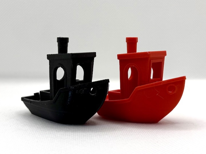
A quick, tongue-in-cheek joke about the current absurdity surrounding the licensing of 3DBenchy, the until recently beloved de facto mascot of 3D printing. Available on MakerWorld (CC BY-NC-SA, of course).

Keyboard Tray and FreeCAD

4 Jan 2025
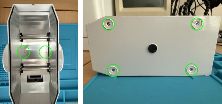
FreeCAD rendering of a monitor arm brace

Since going remote at the start of the pandemic, I’ve had a standing desk setup at home. Rather than an adjustable height desk, I kept my existing desk and put the monitor on a tall VESA mounting arm. Combined with this, I’ve used a variety of stands to sit on the desk and raise the keyboard and trackball to elbow height. These work fine, are a bit cumbersome to move out of the way when you want to use the desk at normal height. So, as a little holiday project, I decided to upgrade to an arm-mounted keyboard tray.

My initial plan was to mount this on the same pole as the monitor, but it ran into a snag — the arm I’d found was from different manufacturer, and was designed for a pole a few millimetres thicker. What I needed was a plastic sleeve, and as it happens I now have a way to make random plastic parts on demand. A few lines of OpenSCAD and twenty minutes of printing, and I had a simple sleeve to adapt the arm to the existing pole. Problem solved. Well, the first problem, anyway.

When I connected everything back up, it became rapidly apparent that the action of typing caused the monitor to wobble quite a bit. This would be annoying at the best of times, and even worse on video calls (as the camera is on top of the monitor). I reconfigured everything so that the keyboard was on a separate pole, but this didn’t solve the issue; both were attached to the desk, and the vibrations from typing still wobbled the screen to an unacceptable degree. Clearly more was needed.

Taking a step back and looking at it, I concluded that the best approach would be to add an additional brace attaching the top of the pole to the wall (the bottom remains fixed to the desk; I didn’t want to ditch the pole entirely as it allows the height of the keyboard to be adjusted). Again, the ability to make custom parts to the exact specifications needed saved the day — I’m starting to see that this will be a complete game changer for DIY jobs around the house.

I could have designed the brace in OpenSCAD, but I took the opportunity to try out FreeCAD. Where OpenSCAD is essentially a programming environment for Constructive Solid Geometry, FreeCAD is a lot closer to a traditional CAD system. Given my background and prior experience, I’d expect the former to be more natural, but to my surprise I found the latter to be a better fit for more complex designs. It’s early days, and I suspect that I’ll end up using both packages in different contexts, but from what I’ve seen so far the extra power and flexibility of FreeCAD is worthwhile even for a beginner like me.

This capability comes at the cost of complexity; my mental model of how FreeCAD actually works is very much a work in progress, and the UI is a mass of toolbars, views and states that I’m still groping around as if blindfolded. How much of this complexity is inherent to a “real” CAD package, and how much of it is due to shortcomings specific to FreeCAD, remains to be seen. I might take a look at Fusion 360 as a point of comparison, but its “free for hobbyists” license makes me wary of investing too much time into it, at least at this stage.

Back to the keyboard tray problem, I got a first version designed pleasingly quickly, but on printing it out realised that I’d based it on the measurements of the narrower pole and so the piece wouldn’t fit. Suitably chastened, I fixed the mistake, and while I was there added a few refinements like countersinking the screw holes and adding fillets. This time, I stopped the print after the first few layers to provide a piece that could physically confirm the sizing. It was spot on, so I printed the whole thing, and installed it.

I’m pleased to report that it worked like a charm — a rock solid keyboard tray arm, and no vibration of the monitor. It was a bit more of a roundabout route than originally intended, but I got there in the end, and learned some things along the way. I’ll call that a win.

Books of 2024

31 Dec 2024

I’ve always enjoyed reading, both fiction and non-fiction, and try to make time for it as much as I can. A few years ago I thought it would be nice to keep a record of what I’ve read, but I’ve never got on with reading-based social services such as GoodReads and BookWyrm. Hence, I decided to go for something more basic: for a while now, I’ve recorded what I’m reading, and when, in a simple Jekyll data file as part of this site. This is mainly for my own notes, but also helps generate the /now page. What’s more, now that I’ve been using the system for a full calendar year (I started mid-2023), I can use it to look back on what I’ve read over the last twelve months.

(The yellow bars indicate when I started and finished each book; the open ones are the end are for books I still have on the go.)

This year, the standout discovery was Nichola Griffith. I picked up Hild in January as it’s set in a part of the world with which I’m a little familiar, at an interesting period in history. Hild delivered on that, but more importantly it’s enormously evocative of a very alien period, has a plot that rattles along, and one of the best cast of characters I’ve read in a long while. A truly surprisingly bombshell dropped literally in the last couple of pages make the follow-up Menewood pretty much non-optional. I also read and enjoyed Griffith’s first novel, Ammonite, and will definitely be returning to her again.

I’ve also returned to a familiar author: William Gibson. He’s mostly know for his pioneering role in the development of cyberpunk, in particular Neuromancer and its sequels. The Bridge trilogy (Virtual Light, Idoru and All Tomorrow’s Parties) is less well known, but reading it for the first time I’ve been struck how many ideas that are real today — cybercrime franchises, social media, deep-fake sextortion — turn up pretty much fully-formed in fiction from a quarter-century ago. They’re also excellent books in their own right, and I’m very much looking forward to the concluding part of the Jackpot trilogy coming out (hopefully) in 2025.

Moving to non-fiction, The High Frontier and The New World on Mars was an interesting look at the arguments in favour of humanity moving beyond this planet, and made an good counterpoint to the more sceptical A City on Mars that I read at the and of last year (my brother was keen I got both sides of the picture). Rereading The Humane Interface provided an interesting perspective on the 40th anniversary of the Mac, and I’m working on-and-off through both Understanding Deep Learning and Google’s Site Reliability Engineering in the context of work. Both are available online for free if you’re interested in the subjects.

Overall, I’m glad I started recording what I’m reading, and have enjoyed taking the time to look back over it as I write this review. I think this might become an annual feature.


For reference, here’s a full 2024 list:

This site is maintained by me, Rob Hague. The opinions here are my own, and not those of my employer or anyone else. You can mail me at rob@rho.org.uk, and I'm @robhague@mas.to on Mastodon and robhague on Twitter. The site has a full-text RSS feed if you're so inclined.

Body text is set in Georgia or the nearest equivalent. Headings and other non-body text is set in Cooper Hewitt Light (© 2014 Cooper Hewitt Smithsonian Design Museum, and used under the SIL Open Font License). BBC BASIC code is set in FontStruction “Acorn Mode 1” by “p1.mark” (licensed under a Creative Commons Attribution Share Alike license).

All content © Rob Hague 2002-2025, except where otherwise noted.