The Corne Maze
My previous post was a timeline of my first proper keyboard build, written as I was actually going through the process. But what about the final destination, and why did I decide to go there?
The world of custom keyboards is vast and varied, and you can pick and choose components to end up with almost anything you could want. If you so desired, you could put together a very nice version of a standard keyboard. However, I figured that, if I’m going to make something, I may as well go for something a bit more exotic and tailored to my own preferences.
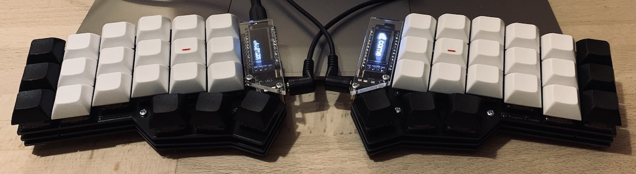
One thing I have a strong and long-held preference for is split keyboards. My current everyday keyboard is a Microsoft Sculpt, and I’ve been using it and its predecessors for decades. There are plenty of kits for building keyboards with similar layouts, but I decided to go a step further and try a true split keyboard. Here, the two halves are physically separate and connected with a cable, allowing them to be positioned independently.
Another variation that I wanted to try was an ortholinear keyboard. The staggered layout of standard keyboards — where the A is offset a little relative to the Q above it — is inherited from typewriters, to allow room for the levers to sit next to each other. Freed from this constraint, you can arrange the keys in straight columns, meaning that each finger only has to move up and down, rather than left and right. It’s not clear how much difference this makes, but it sounded interesting enough to be worth a try. I settled on a Corne Light kit (as with most of the rest of the components, I got it from Mechboards UK, who’ve been an excellent source for this kind of stuff).
Sound is another choice. The first image that will pop into many people’s heads when they think of a mechanical keyboard is rapid-fire clattering, like a thrash metal cover of Nine to Five. There’s some truth to this — the whole point of a mechanical keyboard is that there’s a definite physical action when you hit a key, and that will unavoidably come with some sounds — but it’s a matter of degree. Some aficionados will specifically seek out a particular sound, picking switches with additional components that click when the key is pressed1, giving auditory feedback (and broadcasting to everyone the you’re Using A Fancy Keyboard).
The obvious downside of this, even if you like the sound yourself, is the imposition on those around you. While I’m largely working on my own at home at the moment, this involves plenty of calls, where background clacking would be even more of a problem than in person. Hence, I decided to go for the quietest switch I could find. I ended up with Gateron Ink Silent Blacks. These are a linear switch, meaning that there’s no tactile step when the switch is activated. I think that’s the right trade-off for me, but this is all a voyage of discovery so perhaps I’ll revisit the decision once I’ve used the keyboard for a while.
The final element is perhaps the most visible — the keycaps. There’s a whole cottage industry of short-run and artisanal keycaps (with prices to match), but I thought I’d start simple. I went with blanks DSA ones; these are about as low as you can get for standard, as opposed to low profile, switches, and seemed like a good fit for the rest of the design. I added a little tick of red wire to the home keys, both as a practical aid to touch-typing, and a tiny bit of visual interest.
Overall, I’m pretty pleased with how it turned out. It looks and feels good, and works well. Not at all bad for a first attempt.
-
A bit like affixing a playing card so that it hits the spokes of your BMX. [back]